Early 2000s, all the front pages of the news papers are covered by the same story: crimes are committed in different airports all around the world: John F. Kennedy International Airport, Sydney Kingsford Smith Airport, Cointrin Geneva Airport.. and the list is long. It seems some criminal dark mind is flying around the world to murder people.
It has been months now that the first crimes have been committed and the tragedies continue. People start being scared to take planes and airline companies are worrying about their future.
October 14th, 2010, all airline companies gathered together to find a solution and stop this macabre trend. They obviously called the most qualified team in terms of discovering mysteries: the one and only Sherlock Holmes along with his little sister Enola Holmes, and his best friend Doctor Watson.
Fortunately, the team has taken the ADA course from EPFL and they have a large collection of data about people’s movements around the world. Enola Holmes proposes to analyse this data to get insight about plane travels globally and use it to help them catch the murderer before he strikes again.
Will this be enough to discover who’s the one?
Here is their analysis.
How can we use data to help solving the case
Goals
We build up on the analysis of the paper Friendship and Mobility: User Movement in Location-Based Social Networks by E. Cho, S. Myers and J. Leskovec which analyses the mobility of people and tries to unravel connections between movements and friends. Here we want to analyse more precisely the long-distance travels by plane using the data and some methods from the paper. Our main goals are to:
- Find which countries travel the most.
- Detect patterns in global air traffic over the year.
- Describe the network of airports.
- Find the most visited destinations by country.
- See if there is a connection between friends and visited countries.
- Check if it is possible to predict home areas based on travel patterns.
Key findings
We can observe that there is a bias in the original data, which over-represents users from similar countries and maily the US. We found that:
- People that travel the most are usually from countries with the largest GDP per capita.
- We notice that traffic intensifies in different periods of the year according to the hemisphere in which a country lies.
- The network of airports is tightly connected and mainly constituted of 3 hubs (North America, Europe and Eastern Asia).
- Very large countries frequently travel domestically and language plays a crucial role in the choice of destinations.
- There is some overlap between main destinations and countries with most friends.
- We manage to predict the living continent (North America, Europe or Asia) of a user based on his travel patterns with an accuracy of 80.4%.
Data at our disposal
The data we have at our disposal represents over 10 million check-ins of 1.2 million users from the apps Gowalla and Brightkite. Each check-in represents a time a user has used the app and his or her GPS coordinates were recorded along with a timestamp. We also have the social network of these users. This network represents the friendships between all users.
Thanks to these check-ins, we have estimated their homes, by discretizing the world into 25km2 cells, and taking the average of the check-ins inside the cell which contains most of them. We do this in two steps as there can be users who have been to multiple places around the world for holidays or work and we do not want to just take the average of all their check-ins. For example, if we just did the global average, a user that lives in Switzerland and has been to a long duration trip in Tahiti for the holidays would have his home estimated somewhere in the ocean around South America. By first taking the cell where the user has been the most, we can then confidently take the average without having too much of a bias.
The following map shows all estimated homes, with a color scale representing their density. Warm colors represent areas with a high density of homes, whereas cold colors represent areas with a scarse density of homes.
By looking at the interactive map above, we can see that the density of our data is far from being uniformly spread around the world. There are some areas of the world such as Central Africa and Central Asia which are almost not covered. We see that most users we are considering are living in North America, Europe and Japan.
This fact should be considered in the subsequent analysis we do as it is based on data mainly covering specific and, one can even argue, similar areas of the world. Indeed, we might, as a lot of research in the scientific litterature, suffer from a WEIRD (Western, educated, industrialized, rich and democratic) bias. For example, it is quite probable that potential users that are not covered in our data and do not come from WEIRD countries will have other patterns in their long distance travels. The results we state should thus be taken with a grain of salt.
How to detect plane travels
We now want to detect plane travels from the check-ins we have. To do so we look at all the check-ins of each user and consider all pairs of consecutive check-ins that are far enough as a plane trip. An important parameter we need to consider is what distance to use as a threshold to determine if two check-ins are distant enough. After trying different values we decide to use 500km as a minimum distance. Indeed, we think that it is really likely that a majority of trips longer than this are done by plane. To make our analysis even more precise we decide to detect the airports used at the beginning and end of each trip. To do so we take a list of all airports in the world and determine the closest one to each check-in right before and after the detected long-distance trips. As our list of airports contains very precise data (airports, small airports, aerodromes, heliports, military bases, etc…) we decide to only consider large airports as these are the ones used by most commercial airline companies for their regular trips.
Below we show the distribution of distances between our estimated airports and the check-ins that happen just before and after a trip.
We see that our estimation works well, indeed most check-ins before and after a long distance trip are usually close to airports. However we see there are some outliers after 1000km which are very far from airports for their long-distance trips. After analysing those we realize they are mainly a few trips to really remote part of the world such as Antarctica and the Arctic and some remote islands without large airports. Because these represent only a small proportion of detected trips, we safely ignore them.
After doing this we get the information for 24’243 trips made by plane between 606 airports worldwide.
Which countries travel the most?
Now that we have detected plane travels, we want to see which countries have residents travelling the most. As this question can be interpreted differently, we will use two metrics: the travelled distance and the number of flights to be as thorough as possible. To have comparable data, we normalize it temporally to have the flown distance and number of flights over a year and then we divide the results by the amount of users per country, so that our metrics correspond to an average year for an average user of each country.
Below, we show the top 10 countries according to each metric:
| N° | Country | Travelled distance over a year | GDP per capita ranking (IMF) |
|---|---|---|---|
| 1 | Sweden | 21'537 | 12 |
| 2 | Singapore | 10'064 | 6 |
| 3 | Switzerland | 8'903 | 2 |
| 4 | Norway | 7'971 | 4 |
| 5 | Austria | 6'476 | 13 |
| 6 | The Philippines | 6'243 | 119 |
| 7 | Belgium | 6'214 | 16 |
| 8 | United States | 5'549 | 5 |
| 9 | China | 4'931 | 59 |
| 10 | Australia | 4'919 | 10 |
| N° | Country | Travelled distance over a year | GDP per capita ranking (IMF) |
|---|---|---|---|
| 1 | Sweden | 10.1 | 12 |
| 2 | Norway | 3.8 | 4 |
| 3 | Switzerland | 3.1 | 2 |
| 4 | United States | 2.6 | 5 |
| 5 | Austria | 2.5 | 13 |
| 6 | Belgium | 2.4 | 16 |
| 7 | Singapore | 2.2 | 6 |
| 8 | Germany | 1.9 | 15 |
| 9 | Denmark | 1.8 | 7 |
| 10 | Mexico | 1.7 | 71 |
We notice something interesting when looking at the tables above, most present countries are also in the top 20 of GDP per capita according to the International Monetary Fund (IMF). This illustrates a correlation between their economic well-being and their capacity to travel by plane. However, there are some outliers, in the first table we see that people living in The Philippines, even though they are ranked low in GDP per capita, are flying a lot of mileage. This is not surprising since their country is made of 7’000 islands in the ocean, so every time they travel they need to cross the waters around them in order to reach any destination. This intrinsic way of travelling will naturally increase the flown distance more rapidly than a landlocked country such as Switzerland, even though they travel a bit less frequently (N° 14 in most trips per year). We also see that people living in China, are not in the top travellers by number of flights (N°15 in most trips per year) but tend to fly far, similarly to people from The Philippines. The average Chinese user is thus flying less frequently but further. For Mexico, we see the opposite trend, they fly more frequently but shorter distances (N° 20 in furthest distance by year). This might be due to the fact that their country is large enough so that they take frequently short domestic flights which are cheaper than long international flights.
Flight patterns over time
We now want to see how these two metrics evolve throughout the year. We look at the variations between months of the year in this section.
First, we show the following GIF that depicts all airports and the number of flights connecting them throughout a year. The darker the link between them, the more connected the airports for the given month.
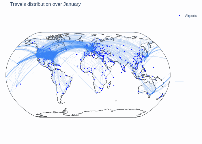
We can see that there are three big clusters for the global air traffic: North America, Europe and Eastern Asia. The airports in these clusters are strongly connected among themselves and the three big clusters are also well connected with eachother. This network can thus be considered as one with three big communities that are very dense and that are connected with so called weak ties which are significant.
We also notice some varying trends throughout the year. It seems that there is more traffic in January and during the summer, but to be more certain about this claim we make a more granular analysis.
We first look at the distance travelled by month. The following bar plot shows how an average user travels throughout the year. We should note that this might be a bit biased towards the US as it is the country with most users.
We see that there is a significant increase in flown distances between May and October as we saw in the animation above. This might be explained because it is usually a time of the year when lot of people we have represented in the data (North America and Europe) have summer holidays and consequently the time to go on longer trips further. However we do not see the increase of traffic in January on this global trend. To look into more details we analyse the trend per country:
Here we see something interesting, there is a divide between countries in the Northern and Southern hemispheres of the globe. People living in Europe and North America tend to have a peak of travels in the summer months (June to September), while users from countries in the Southern hemisphere such as Australia, New Zealand, Brazil, Argentina or South Africa tend to have a peak in the first months of the year. This might be due to the fact that this corresponds to their summer and it is when schools are on holidays and families tend to have more time for travelling. This can also explain why we are seeing more traffic in the animated gif of air traffic above.
We now do the same analysis for the number of trips. We first show the global trend:
The trend we observe here is very similar to the one for the flown distances, meaning that the periods when users travel further are the same as the periods when users travel frequently. To see if we also observe a North/South divide we show the data per country:
As one could expect, we see the same trend appearing for the number of travels.
Analysis of the global network of airports
We now would like to see how the airports are connected among themselves. The 606 airports form a graph which is interesting to analyse. First we note that all airports form one connected component, this means that it is possible from any airport to reach any other airport in the world. It is sometimes needed to do layovers through other airports but it is always possible to reach any final destination from any starting airport. We do not have a scenario where some subset of airports are fully separated from the rest. We use different metrics to measure how tightly interconnected the airports are. We first see that the average shortest path between two airports is 1.96. This means that going from any airport A to any airport B on the globe takes on average just below two trips.
We are now interested to see what are the top 10 most important airports. For this we will use two metrics.
First we look at the most connected airports, i.e. the airports with the highest degree:
| N° | Airport (Country) | Connected to |
|---|---|---|
| 1 | La Guardia (US) | 404 |
| 2 | London Heathrow (GB) | 379 |
| 3 | San Francisco International (US) | 361 |
| 4 | Los Angeles International (US) | 359 |
| 5 | Denver International (US) | 343 |
| 6 | Stockholm-Arlanda (SW) | 331 |
| 7 | Norman Y. Mineta San Jose International (US) | 328 |
| 8 | Metropolitan Oakland International (US) | 323 |
| 9 | Austin Bergstrom International (US) | 312 |
| 10 | Tokyo Haneda International (JP) | 290 |
We see that each one of the three big clusters we mentioned earlier (Nort America, Europe and Eastern Asia) in the air traffic animation has at least one airport that is really well connected to the rest of the network. We note that the United States is the country with the most connected airports.
Then we look at the betweenness of airports, this measure tells us which airports are used the most often to travel between any two random airports worldwide.
| N° | Airport (Country) | betweenness score |
|---|---|---|
| 1 | London Heathrow (GB) | 0.044 |
| 2 | La Guardia (US) | 0.039 |
| 3 | Stockholm-Arlanda (SW) | 0.031 |
| 4 | Los Angeles International (US) | 0.027 |
| 5 | San Francisco International (US) | 0.025 |
| 6 | Tokyo Haneda International (JP) | 0.025 |
| 7 | Denver International (US) | 0.022 |
| 8 | Norman Y. Mineta San Jose International (US) | 0.022 |
| 9 | Austin Bergstrom International (US) | 0.016 |
| 10 | Paris-Orly (FR) | 0.016 |
In the table above when the airport has a high betweenness score, it is one of the most frequently used when travelling between two airports with the least amounts of layovers. Not surprisingly, we see that most of the airports that have a very high betweenness score are also some of the most connected. We also see that each of the three clusters are represented in this table.
Top 10 visited countries from each country
We now want to see what are the top destinations that are visited by plane from users of each country. To answer this question we need to be careful and not include return trips of users as this would just over-represent the home country. We still consider domestic flights as these can be made to visit a different place of the same country. Below we show the top 10 most visited countries for each country.
We notice some interesting trends. First, most of the plane trips are made domestically for large enough countries (US, Russia, Brazil, China, Australia…). Second, people from countries in Europe travel mostly to European destinations. Lastly, we see that language plays a crucial role in the choice of destinations. Countries speaking the same language tend to travel to each other. For example english speaking countries such as Great Britain, The United States, Canada and Australia are in each other’s most visited destinations. The same pattern can be observed with Latin American countries and Spain and also with Portugal and Brazil.
Top 10 friends’ countries of each country
Until now we mainly focused on the mobility of people. To expand our research domain we want to analyse what are the friendships’ relations between users of different countries based on the two friendship networks we have at our disposal. To do so, we check all the friends for all users of each country, this way we are able to identify the degree of friendship between any pair of countries. To show the most significant results, we choose to only take the top ten friends’ countries for each country.
As stated before, the results need to be taken carefully because of a bias in favour of North America.
Unfortunately, we can see that most of the countries have unexpected data for their friendships. Indeed it would be realistic that most friends of people living in a country are also from the same country. However, many countries seem to have the majority of their friends in the US. The reason for this might be that the data from the apps Gowalla and Brightkite does not reflect the actual distribution of friendships. We are only confident with the data presented in the case of the United States, as we obtain the majority of friends inside the country (70.81%) followed by friendships in the United Kingdom and Canada which are both english-speaking countries. When overlooking percentages for other countries, we can see that there seems to be an overlap between most visited destinations and countries with most friends. However, we would need more data about global friendships to confirm this trend.
Predicting home areas
Finally, we check if it is possible to infer people’s home areas based on their flight patterns. Predicting the country home area is quite difficult because we have not a lot of data, and too much bias in it. In order to be more global, we decide to predict if a user lives in North America, Europe or Asia, the three most represented continents. For each continent, we picked users that travel the most so that they represent the most their home area, as we see that some users of the apps don’t have a lot of logged data and we are probably missing their travels.
Because we have a lot of dimensions of information for each user we use a common technique called PCA to reduce these dimensions to only two significant ones so we can plot the data and see how the three groups are spread.
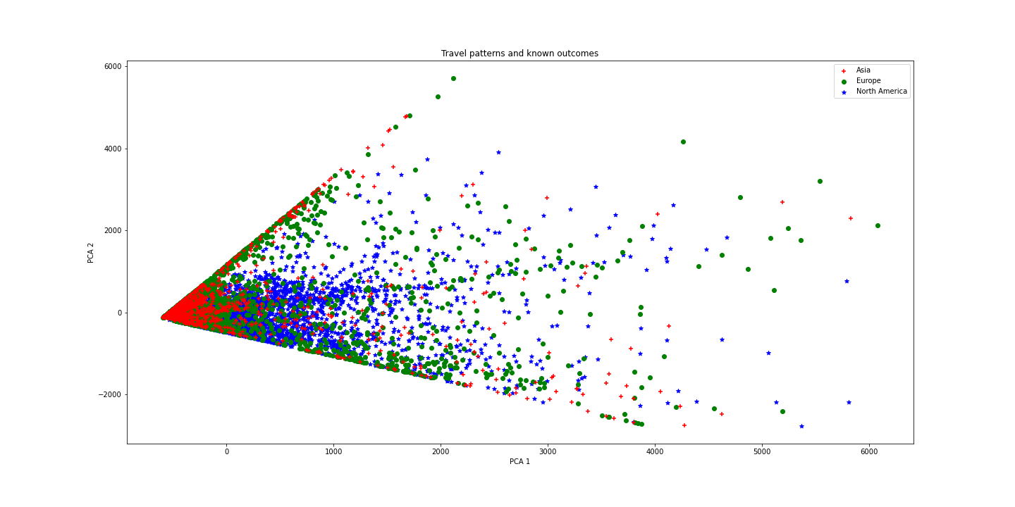
We can observe a link between patterns and continents, so we now try to use Machine Learning techniques to predict the desired result.
Predicting at random between 3 continents would yield a score of 33%. We use a neural network to predict home area based on the number of trips and the distance traveled and we obtain an accuracy of 80.4%. This implies that predicting the continent where a user lives is possible using travel patterns over a year. With more balanced data, it may even be possible to predict a user’s home country based on his flight patterns!
Conclusion
We performed an analysis on data on human mobility to get insight on the travels made by plane. We note that the underlying data suffers from a WEIRD (Western, Educated, Industrialized, Rich and Democratic) bias. We found that countries which fly most frequently and the longest distances are usually the same and they highly tend to posess a high GDP per capita. Also, we detect patterns in air traffic throughout the year, we notice that the Northern and Southern hemisphere travel differently, each having a peak of travels in its respective summer. We observe that airports form a connected graph all over the world with three hubs in North America, Europe and Eastern Asia. By looking at the most frequent destinations per country we observe a trend based on language: people travel to places in which they speak the language. We also see that people from big countries tend to travel a lot domestically and Europeans travel a lot in Europe. The data we have on friendships is highy biased towards the United States and we cannot show a clear link between friends and visited countries but we can see some overlap. Finally, using Machine Learning techniques we are able to predict the home continent of a user from Northern America, Europe or Asia based on its travel patterns throughout the year. Our model is encouraging and with more data it could even be possible to predict users’ home countries.
This analysis can help for the mysterious murders in the following way:
- Focusing on the most central airports stated above could help in finding the criminal.
- If the home country of the murderer is known, we can reduce the list of destinations to the top 10 visited ones and to the time of the year when there are more travels.
- On the contrary, if the home country is unknown but we have travel data, we can use the prediction model to estimate the home country of the criminal.
About the team
| Sherlock Holmes | Enola Holmes | Doctor Watson |
|---|---|---|
 |
 |
 |
| Alexander Apostolov | Maina Orchampt-Mareschal | Valentin Garnier |